
Tuesday, July 10, 2012
Live Life Creatively: Photo Website Launch & Spokesmodel Search
Live Life Creatively: Photo Website Launch & Spokesmodel Search: Today marks the big day...the launch of my long awaited photography website . Eventually, I hope to have a custom designed website whic...


Photo Website Launch & Spokesmodel Search

Today marks the big day...the launch of my long awaited photography website. Eventually, I hope to have a custom designed website which will join together all of my creative worlds, but this new site is so exciting from a photographer’s standpoint. Here, you can find out more about me, my photo services, and check out examples of my portfolio.
Once you visit the homepage, you will see a slideshow of photos featuring babies, children, teens, couples & families. One unique aspect to my photography business is my not-so-secret weapon, my design & creative skills! As an artist, I bring my creative eye when composing photos, looking for colorful and interesting backgrounds, locations and perspectives. My extensive background in photoshop adds to my editing capabilities as well as the option to offer my customers custom portrait art combining design techniques with their photos. See examples of some art portraits on this page of my site.
I also use some of my own stock photography images to create photo art, both of which will be available for purchase as prints on my site. Be patient with me as I work on building to the stock photography library!
INTRODUCING OUR FIRST ANNUAL SENIOR SPOKESMODEL SEARCH CONTEST
Do you know a local high school senior who is outgoing, comfortable in front of the camera and enthusiastic when it comes to talking about things that they like? Encourage them to enter our Spokesmodel Contest. Note that we will be doing another contest for Juniors in the Spring 2013!
Click here to go to our Contest Website page.

If you pop by the photography website, be sure to leave me a message
and let me know what you think of it, and which are your favorite photos!
To keep updated on my latest shoots and happenings at
Cheri Wenger Design Photography, hit the like button on my facebook page.
You can click on the FB button link at the bottom of my website or click here.
Tuesday, June 26, 2012
The Beauty of Textures
This is another photo art creation using photos taken of a bouquet of carnations. I merely wanted to take a picture of them to preserve their beauty so my daughter could remember that Valentine’s day gift. I couldn’t photograph them indoors because the lighting just wasn’t right, but when I simply placed them out on the table on our lanai, magic happened. I was able to photograph them like a painting and convey the beauty that my eyes were seeing. However, in adding Kim Klassen’s textures to the image, really turned this piece into art.

Beauty Fades
© 2012 Cheri Wenger Design Photography
Photo art featuring textures by Kim Klassen.
To see the evolution, you must see the original photo.

It has a warmth to it, but I love the vintage look of the finished art
achieved by adding Kim’s Just Blush texture plus some of my own textures
and quote to it! Check out Texture Tuesdays challenges with Kim. This is her justblush texture:

Here are the two of my own photo textures that I applied to the image that helped to add that dreamy, watercolor look to the image. For those of you not familiar with photoshop, you can layer photos, textures, text and color over photos in varying opacities with different layer style choices to achieve very dramatic or very subtle effects.


The two photo images above were photos taken of the glass block window in our master bath. The third image, below, was a closeup taken of our textured wall. So you see, creativity exists all around us, just waiting to be used and appreciated!

In the first image, I changed the hue to a sepia tone look. It includes wispy textures from the floral arrangement that sits on the ledge.These are all colored textures, however you can use b&w textures/photos to create effects. Don’t be afraid to experiment & live life creatively!
Here’s a peek at my layers palette in photoshop so you can see the order of the layers used.

Thursday, June 14, 2012
Live Life Creatively: Using the Hottest Colors in your Card Creations
Live Life Creatively: Using the Hottest Colors in your Card Creations: ...see if you can guess from these two card samples the latest "in color"!
Using the Hottest Colors in your Card Creations
Yesterday I picked up an issue of In Style magazine and my eyes settled on a page featuring shades of watermelon pink as one of the latest, hot colors to wear. Maybe I am a bit psychic when it comes to picking in colors, LOL, but I just created two cards last week featuring that color. In the first card I have paired it up with a hot coral color and used the technique I shared in my last post for handcoloring your stamp with markers, only I did not spritz this one, I let the markers blend the colors on the stamp.
Another fun thing to try is stamping a verse and cropping it with a punch so it is still readable, yet it works with diecut frame. I used varying circle punches on this example with a diecut frame by Stampin’ Up!®. The result is a clean, simple, yet cheerful birthday card.
Mum’s Birthday
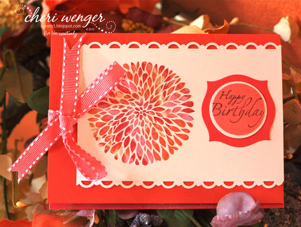
The textured watermelon cardstock used on this card, below, was embossed with a texture. I added interest to my punched scalloped circle by doing the repetitive stamping technique to create light and dark values of ink using this beautiful stem from the Watercolor Trio set from SU. The loopy border punch is from the Martha Stewart Collection. I used multiple embossing folders & punches on this card to create interest and texture, especially on the petals which were created using the 5 petal punch, embossing then cutting them in 2 or 3 petal sections to create leaves. The scalloped circle was raised up using dimensional foam, also allowing the sheer ribbon and petals to be placed underneath.
Strawberry Floral

So before you start your next card creation, take a peek online or in the fashion and home magazines to see what the latest, hottest colors are. It may just give you the creative spark you need to...

Sunday, June 10, 2012
Manly Cards for Any Occasion
With Father’s Day just a week away, you may be looking for some inspiration for making some masculine handcrafted cards. From an easy breezy military themed sample to feeling the coastal breezes, here are some samples to get your creative juices flowing...
For this card I wanted to do something special for my husband who is a terrific dad so I built a scene from stamps and techniques. For this I used a wave and palm tree stamp. For the sun, I used a punched circle and a sponge to define the shape then used markers to color in the sun. The sky was created using pastels. See below for some tips on creating the white ocean edge and shoreline.
Coastal Paradise Card created for Father’s Day
(but is suitable for any occasion!)

I first tore a strip of card stock to create a deckled edge. When stamping the ocean, I stamped over top of the strip to create a more natural shoreline. Then I used the same strip and a blender marker to rub some of the ink over the deckled edge it and onto the card a slight space away from the bottom of the wave. This creates the white foam area. For the sand, I used a combination of colored markers and a to create the spattered look, I used my old Stampin' Up spitzer with brush markers for the ocean spray and to give the sand it's sandy texture.
Note: I also used Ivory naturals Cardstock as my background which already has some texture to it.
Tip: to extend the surf on each side of the palm, stamp a tree onto scrap and cut out. Use this as a mask with some temporary adhesive when stamping the waves in the background.

I wanted a softer edge, so I used my corner rounder on the 4 corners.

To finish the card, cut strips of coordinating cardstock and arrange in assorted lengths for background. I grabbed a piece of soft raffia from my scrap pile to tie around the art before mounting on the card. Being a tropical state of mind, I wanted to create another card with this palm tree image. I will also share with you my technique for creating the multi colored watercolored foliage stamped in the background along with a tip for putting coffee filters to use in your cardmaking. Read below!
Palmy Breezes Card
(another Father’s Day creation suitable for any time of year)

Turn your rubber stamp face up and color entire image with a very light color marker. Randomly color over top with 2 - 3 other darker shades. Be sure to "clean" your brush marker off by rubbing off any of the colors it may have picked up onto some scrap paper before storing it away! Use a spray bottle of water to mist over the stamp lightly before stamping onto background. This is what gives it that watercolor, washy look.
Coffee Filters aren’t just for coffee!
Take a coffe filter and mist it with colored spray mist. I used a walnut ink on mine. Crumble and fold it, then tear of a piece of it to incorporate on your card creation.
Golden Years Birthday Card
(could also be used for Father’s Day or any occasion)

Sometimes card creating dictates trying things outside of your comfort zone or working with colors outside of your normal favorites. I created this card thanks to the extreme generosity of my stamping friend Ree Nathan, a fabulous SU demonstrator, who shared with me some of the new patterned papers, etc. from Stampin’ Up!®. I was so excited to test out the pack of In Colors and markers she gave me the day we had lunch and stamped...can’t thank her enough! I used some of those new In Color markers on the Coastal Paradise card, too! I got to play with some of the frame dies and new patterns. I wouldn’t have picked this color combination ordinarily, however I do like the end result.
Now it’s your turn...
Let’s slow things down a bit and end with an easy to make card layout. For my starting point, I merely stamped this old military theme rubber stamp into the upper area of a piece of trimmed cardstock I grabbed out of my leftovers stash. I built the card from there coordinating another patterned piece of cardstock and some solids to go with it. To complete the look, I added a pennant, a vintage gold button with thread and a Father's day stamped verse. To give it an aged feel, I sponged and dragged ink over the edges.
Military Style Father’s Day Card
(simply change out the sentiment to use for other occasions!)

Easy, Peasy, right? The rest is up to you! Happy creating and an early happy Father’s Day to all the great dads out there!
Thursday, June 7, 2012
Fish all day...tell big lies!
This fish themed poster is another addition to my Cheri Wenger Design Photography photo art collection combining my photo image with actions, textures and text. It is such a fun way to combine my design and photographic talents. Here is the finished result...

But here is where it all began..
This is a peek at my original photo shot at Indialantic Beach,
where all my creative thoughts began!

Next I used a combinations of actions and
layers in Photoshop to create this look...

Then I combined some yummy textures designed by Kim Klassen for
her Texture Tuesday Cafe. For this effect I used 2 textures,
revolution and musiclovin, shown below.


Design © 2012 Cheri Wenger Design Photography
I liked the result, but really wanted to add a quote to turn
it into a fun work of art! I researched some quotes and
decided on this one by an unknown author to
finish the artwork shown above.
If you are interested in purchasing a print or canvas art
of this, contact me by email and I can get you pricing,
depending upon the size you would like at artz1@cfl.rr.com.
Friday, May 25, 2012
As You Graduate
Today is the last day of school and now our baby will be an official senior. I am holding on because I already know how fast this ride goes! Summer will fly by in a flurry, admissions essays, SAT & ACT exams will be taken and Kylie will start her college applications and school tours. Next it will be her final season of volleyball, senior night, powder puff, senior project, prom and the final yearbook signing...all leading up to graduation night. It took me a few minutes to summarize in words and I believe this year will fly by equally as quickly when looking back. So seniors...savor every moment! Soak in every great lesson there is to learn and focus on having no regrets when you graduate. Congratulations to Joe, John, Meagan, Kaitlyn, Adrian, Nick and all the other graduates of the Class of 2012!
For this year's grad cards, I found inspiration from a card that I cased on Pinterest, created by Beth Apalooza.


For this year's grad cards, I found inspiration from a card that I cased on Pinterest, created by Beth Apalooza.

Making it My Own
I modified the design slightly and created these cap & gown cards in assorted colors:

These are perfect to use as cards, announcements or thank you notes!
Here are some close up pictures of the individual cards...
The West Shore Colors (Navy & Silver)

Viera High Colors (Green & Gold)

Standard Black & White with Gold
(this one is for my niece's 8th grade graduation)

The easiest way that I found to mass produce these cards was to cut out templates of the paper piecings.
Here are some of the dimensions that I used:
Large triangle: 4-1/4" tall x 3-5/8" wide
Smaller triangle: 2" tall x 1-1/2" wide
Cap: 2-1/4" square
Striping: Cut 1/4" x 3-1/2" strips to glue and overlap under cap; trim excess from top of card.
Now for the tassel making tips:
1. Cut your template. I used a scrap of card stock 1-7/8"w x 2"h (*Note: the width doesn’t matter).
2. Wrap colored floss (embroidery thread) approx. 8 full loops around the cardstock and cut end.
3. Thread a small piece of thread under the top strands and knot.
4. Next cut the bottom strands to remove from template.
5. Cut a small piece of floss long enough to blend the ends in with the tassle.
6. Make another small knot to create the top of the tassle and blend threads in with the rest of the tassle. 7. Punch hole or make a slit with a cutting blade and mat to thread top tie of tassle through the hole.
8. Insert colored mini brad in hole, knot the floss and trim before gluing onto card.
**For added dimension, you can use double sided adhesive foam on back side of the cap.
Other ideas:
• Add a personalized mini diploma created on your computer.
• Dress up girl cards with rhinestones, mini pearls or bling, as on the card I cased.
• Use white or metallic alphabet stickers to personalize or add messages.
• Stamp a verse in versamark ink, then heat emboss in white or gold on the front or inside of cards.
(I did this on inside as well as to dress up the outside of the envelope. I used a collage of Good Luck, Congratulations and Graduation stamps and used the writing tip of the Versamarker pen to write in the lucky grad's name before embossing with gold embossing powder.)
Wednesday, May 23, 2012
In Search of Dolphins

We were renting a home beachside near the Eau Gallie causeway so for the first month, the girls and I would randomly drive up by the causeway, park and stand by the Indian River in hopes of spotting some dolpins. We went on the pier behind the library and waited...and waited. We scoured the water from above each time we drove over the causeway (the bridge connecting mainland to beachside), with no real luck. So we finally brought daddy along and discovered Mather's Bridge (a crossing for cars and people connecting Indian Harbor Beach with the southern tip of Merritt Island.) It was here that we had our first, exciting dolphin siting...two dolphins feeding and playing by the bridge. The girls were around 9 & 11 at the time and super excited to see dolphins this close. Finally, it felt like we lived in Florida!
Two years later, we got to experience one even closer doing the Swim with the Dolphins experience at Discovery Cove, something Ashley will never forget about turning 13. Charlotte was our dolphin, a very dominant female who wasn't exactly the cuddly type, however we got to kiss her, touch her, and hang onto her fin and go for a very fast swim through the water. Dolphins are so muscular and full of power. My sister and I posed for a funny photo trying to lift the dolphin, or at least pretend to. Good things our lives didn't depend on it because even in water, they are extremely heavy!
Today’s card reminded me of these fun dolphin experiences. I used an swirly embossing template on my cardstock, inked a sponge and rubbed it over the surface to bring out the texture more in random spots. In wanting to create a colorful layer, I chose to emboss the retired SU dolphin stamp in silver and use blender pens and markers to create the faux watercolor effect.
Try out some of these techniques when creating your next card:
• Rub ink over embossing to really make the texture stand out
• Use gold or silver heat embossing to contain the colors when using actual watercolors
• Create a faux watercolor effect using markers and blender pens*
*To accomplish soft, subtle colors, rub a brush end of a marker onto a slick surface such as plastic packaging or a piece of acetate. Use a blender pen (marker with brush tip) to pick up some of the color and brush it onto your stamped image. You can use a piece of scrap paper to test color first or to color on and lighten your color before applying to stamped image.
Tuesday, May 22, 2012
Making Birthdays Oh So Sweeter!
Using the great embellishments and papers from Little Yellow Bicycle's Cupcake Love collection can make any birthday card just that much sweeter! See for yourself in these easy to create card samples.

Felty cupcakes are just so yummy!
On the card below I added some rhinestone bling to my verse to coordinate with the heart rhinestone on the cupcake. For bright cheery cards, try this color combo: hot pink, yellow, magenta and white!

The card below also combines a new patterned paper from Stampin' Up!®, a wonderful sample from my demonstrator friend, Ree Nathan.
Sunny Sweet
I just love it when I can mix together a bunch of scraps, some new patterned cardstock, pull a few elements from my vast cardmaking stash pile and turn it into something cheerful to wish someone a wonderful birthday!
I just love it when I can mix together a bunch of scraps, some new patterned cardstock, pull a few elements from my vast cardmaking stash pile and turn it into something cheerful to wish someone a wonderful birthday!

Hope these ideas sweeten your day and help you to..
Saturday, May 12, 2012
A Mother's Day Tribute

Kim offers a Texture Tuesday challenge which inspires artists and photographers to use her textures creatively. For this piece, “In the Garden”, I wanted to create a painterly, watercolor effect. I used a combination of layers and effects at varying opactities. From the Bens Collection, I chose textures 2 & 6, and selected a quote attributed to Claudia Chandi as my verse.
So how did I create this?
I used Photoshop with my original photo on the main layer, add the textures on top. To make the type more interesting I mixed two fonts and three coordinating shades of colors: a deep olive, dark red and a medium shade of rosey pink. Now take a peek below to see all of the original images that were combined to create this art.
Here is the original photo image...

And here are the two textures from Kim Klassen’s Bens Collection that I used...


Check out her Texture Tuesday Cafe,
and be inspired!
Happy Mother’s Day to all the great moms out there who daily work your mommy magic!
Wednesday, May 9, 2012
Ooooh, baby, baby!
There must be something in the air because this Spring, there have been a bunch of friends and family members having babies! This put me in the cardmaking spirit, something I have missed doing lately. I grabbed the cutest little embossing folder, a gift from my stampin' buddy, Trudy, to use on some cards. Keeping in line with a current design trend to use strips of pennants as a background, I created these baby boy cards...

Baby Boy Pennant Card (for new baby)
I added two navy mini brads to the wheels of the carriage! Make this in under 5 minutes!

Baby Boy Mix Card (outside view)
Layered patterned paper pennants with buttons, polka dots and an embossed baby carriage. This card uses a mix of subtle and bold tones of red, white and blue.

(inside view)
Don't be afraid to coordinate the inside of your card with the colors,
papers and design theme used on the outside!

Embossed Carriage Card
White and Blue tones paired up with embossing adds up to an elegant looking baby card. I made this for our friend, Meghan, who recently had her third boy. To bring out the embossing more, you can dip a small piece of sponge into light or dark ink and drag over embossing. On this, I used navy ink to bring out the edges and lighter blue over top of the embossing.
Can't forget about the girlies!!!

Lil' Something Card
Again, I used the same embossed carriage, except this time on a girly themed card. This was made as a congratulations for my cousin Chris and his wonderful wife, Kelly who gave birth to their second daughter, Jillian. By adding some delicate ribbons, a scalloped border and flowers paired with feminine patterned papers, you see how the overall look has changed to a girly theme.
And I couldn't forget about the big sis either!!!

New Baby Sister Card
Didn't want to leave out Brooke, the big sister, so I decided to see just what fun I could have using my owl punch from Stampin' Up!®. To recreate this card choose a couple solid shades of pink to coordinate with a sheet of pink patterned paper. You will also need a sheet of white cardstock and two shades of brown. I used a chocolately shade with a textured taupe color.
You will punch the owl once in white, once in brown and then in each of the pink papers (both solid & patterned). Mix and match the punched items to create the owls. For the diaper, you can cut by hand like I did. Or just cut the legs and top half of the body off of an owl punched from white cardstock...my delayed lightbulb moment! LOL. For the diaper pins, just snip your pieces of one of the solid pink cardstocks. For the Flowers, I used the Boho Blossoms punch and layered with some owl punch leftovers. I used rubber stamps selectively colored with a brush marker to stamp the words A, New, and Baby.
I wrote sister in my own handwriting with a pointed nib marker. By doing these on separate paper strips, I was able to trim to sizes needed and angle on the card. Congratulations was heat embossed with white powder. To make the big sis owl have a bit more interest, I used small white satin ribbon to make a bow. For the baby owl's bow, punch white paper scraps using heart from the owl punch. Combine two hearts with a tiny circle on top to form the bow.
Now that I have show you some cardmaking ideas for babies, next I will share a few cards for the moms. Check back for Mother's Day card Inspiration! Remember to Live Life Creatively!
Subscribe to:
Posts (Atom)